


GEC Rajkot 2026.
Introduction to Tailwind CSS
Tailwind CSS is a utility-first CSS framework that provides low-level, configurable classes to help you build custom designs quickly. By using pre-defined classes, you can apply styling directly in your HTML or JSX without writing custom CSS.
"You can use the official playground below to run this code:"
Common Tailwind CSS Classes
1. Background Colors
The bg classes let you easily set background colors. The format is bg-{color}-{shade}, where {color} represents the color name, and {shade} represents the shade (variations in lightness or darkness of a base color) of the color.
Example:
  <div class="bg-green-500 p-4">Green Background</div>

  //css we have to write if we use css instead of tailwind
  .green-background {
    background-color: #22c55e; /* Tailwind's green-500 color */
    padding: 1rem; /* Tailwind's p-4 (16px padding) */
  }
2. Text Colors and Sizes
Tailwind provides classes for text color (text-{color}-{shade}) and text size (text-{size}). Sizes range from text-xs to text-9xl.
Example:
  <p class="text-black text-2xl">Large Black Text</p>

  //css we have to write if we use css instead of tailwind
  .text-black {
    color: black;
  }

  .text-2xl {
    font-size: 1.5rem; /* Equivalent to 24px, adjust as needed */
  }
3. Padding and Margins
Tailwind includes classes for padding and margin in increments of 1. They can be applied to all sides (p-4), or specific sides (pt-4, pb-4, pl-4, pr-4).
Example:
  <div class="p-4 m-4">This has padding and margin</div>

  //css we have to write if we use css instead of tailwind
  .p-4 {
    padding: 1rem; /* Adds padding of 16px on all sides */
  }

  .m-4 {
    margin: 1rem; /* Adds margin of 16px on all sides */
  }
4. Text Alignment
To align text, you can use text-center, text-left, or text-right.
Example:
  <p class="text-center">This text is centered</p>

  //css we have to write if we use css instead of tailwind
  .text-center {
    text-align: center;
  }
Layout Utilities
1. Flexbox Layout
The flex utility helps create a flexible layout that can be centered or spaced easily.
Centering with Flex:
  <div class="flex items-center justify-center h-screen bg-gray-100">
    Centered Content
  </div>

  //css we have to write if we use css instead of tailwind
  .flex {
    display: flex;
  }

  .items-center {
    align-items: center; /* Centers content vertically */
  }

  .justify-center {
    justify-content: center; /* Centers content horizontally */
  }

  .h-screen {
    height: 100vh; /* Sets the height to full screen */
  }

  .bg-gray-100 {
    background-color: #f7fafc; /* Light gray background */
  }
2. Grid Layout
The grid utility allows you to create a grid-based layout with defined columns and gaps between elements.
Example:
  <div class="grid grid-cols-3 gap-4">
    <div class="bg-blue-200 p-4">1</div>
    <div class="bg-blue-300 p-4">2</div>
    <div class="bg-blue-400 p-4">3</div>
  </div>

  //css we have to write if we use css instead of tailwind
  .grid {
    display: grid;
  }

  .grid-cols-3 {
    grid-template-columns: repeat(3, 1fr); /* Creates 3 equal columns */
  }

  .gap-4 {
    gap: 1rem; /* Adds 16px of space between grid items */
  }

  .bg-blue-200 {
    background-color: #bfdbfe; /* Light blue background */
  }

  .bg-blue-300 {
    background-color: #93c5fd; /* Medium-light blue background */
  }

  .bg-blue-400 {
    background-color: #60a5fa; /* Medium blue background */
  }

  .p-4 {
    padding: 1rem; /* Adds 16px of padding inside each item */
  }
3. Rounded Corners
Use rounded-{size} classes to apply border-radius. Sizes include rounded-md, rounded-lg, and rounded-xl.
Example:
  <div class="rounded-lg bg-blue-500 p-4">Large Rounded Corners</div>

  //css we have to write if we use css instead of tailwind
  .rounded-lg {
    border-radius: 0.5rem; /* Adds large rounded corners (8px) */
  }

  .bg-blue-500 {
    background-color: #3b82f6; /* Applies a medium blue background */
  }

  .p-4 {
    padding: 1rem; /* Adds 16px of padding inside the element */
  }
4. Border Visibility
To see an element’s border, use border and a color, such as border-gray-200.
Example:
  <div class="border border-gray-200 p-4">Border Example</div>

  //css we have to write if we use css instead of tailwind
  .border {
    border-width: 1px; /* Sets the border width */
    border-style: solid; /* Ensures the border is solid */
  }

  .border-gray-200 {
    border-color: #e5e7eb; /* Light gray border color */
  }

  .p-4 {
    padding: 1rem; /* Adds 16px of padding inside the element */
  }
5. Width and Height
Set fixed widths and heights using classes like w-10, h-10, or custom sizes (e.g., w-37, h-37).
Example:
  <div class="w-37 h-37 bg-gray-300">Fixed Size Box</div>

  //css we have to write if we use css instead of tailwind
  .w-37 {
    width: 9.25rem; /* Sets the width to 9.25rem (148px) */
  }

  .h-37 {
    height: 9.25rem; /* Sets the height to 9.25rem (148px) */
  }

  .bg-gray-300 {
    background-color: #d1d5db; /* Light gray background color */
  }
Centering Elements
To center an element in the viewport:
Method 1 (Flexbox):
  <div class="flex items-center justify-center h-screen">
    Centered Content
  </div>

  //css we have to write if we use css instead of tailwind
  .flex {
    display: flex;
  }

  .items-center {
    align-items: center; /* Centers content vertically */
  }

  .justify-center {
    justify-content: center; /* Centers content horizontally */
  }

  .h-screen {
    height: 100vh; /* Sets the height to the full viewport height */
  }
Method 2 (Grid):
  <div class="grid place-items-center h-screen">
    Centered Content
  </div>

  //css we have to write if we use css instead of tailwind
  .grid {
    display: grid;
  }

  .place-items-center {
    place-items: center; /* Centers content both vertically and horizontally */
  }

  .h-screen {
    height: 100vh; /* Sets the height to the full viewport height */
  }
Code Example with Provided Image and Code Snippet
Here's the code snippet you provided, styled using Tailwind CSS:
<>
  <div className="flex items-center h-screen justify-center bg-black">
    <div className="grid items-center grid-rows-5 gap-4 border border-yellow-300">
      <div className="grid items-center border border-pink-300">
        <div className="bg-green-500 text-black text-3xl w-15 p-4 m-4 rounded-md text-center">
          <h1>Winter is here</h1>
        </div>
      </div>
      <div className="grid items-center border border-pink-300">
        <div className="text-black text-center justify-center bg-white text-2xl w-15 h-15 rounded-md p-4 m-3">
          Count : {count}
        </div>
      </div>
      <div className="grid items-center border border-pink-300">
        <div className="text-black text-center justify-center bg-white text-2xl w-15 h-15 rounded-md p-4 m-3">
          Count : {count}
        </div>
      </div>
      <div className="grid items-center border border-pink-300">
        <div className="text-black text-center justify-center bg-white text-2xl w-15 h-15 rounded-md p-4 m-3">
          Count : {count}
        </div>
      </div>
      <div className="grid grid-cols-2 border border-yellow-300">
        <div className="grid items-center border border-pink-300">
          <button className="text-black text-center justify-center bg-white text-2xl w-15 h-15 rounded-md p-4 m-3"
                  onClick={increment}>
            increment
          </button>
        </div>
        <div className="grid items-center border border-pink-300">
          <button className="text-black text-center justify-center bg-white text-2xl w-15 h-15 rounded-md p-4 m-3"
                  onClick={decrement}>
            decrement
          </button>
        </div>
      </div>
    </div>
  </div>
</>

//css we have to write if we use css instead of tailwind
/* Outer container */
.flex {
  display: flex;
}

.items-center {
  align-items: center; /* Vertical alignment */
}

.justify-center {
  justify-content: center; /* Horizontal alignment */
}

.h-screen {
  height: 100vh; /* Full viewport height */
}

.bg-black {
  background-color: black; /* Black background for the container */
}

/* Inner grid container */
.grid {
  display: grid;
}

.grid-rows-5 {
  grid-template-rows: repeat(5, 1fr); /* Creates 5 equal rows */
}

.grid-cols-2 {
  grid-template-columns: repeat(2, 1fr); /* Creates 2 equal columns */
}

.gap-4 {
  gap: 1rem; /* Adds 16px of spacing between grid items */
}

.border {
  border-style: solid;
}

.border-yellow-300 {
  border-color: #fcd34d; /* Yellow border */
  border-width: 1px;
}

.border-pink-300 {
  border-color: #f9a8d4; /* Pink border */
  border-width: 1px;
}

/* Content elements */
.bg-green-500 {
  background-color: #22c55e; /* Green background */
}

.bg-white {
  background-color: white; /* White background */
}

.text-black {
  color: black; /* Black text color */
}

.text-3xl {
  font-size: 1.875rem; /* Font size equivalent to 30px */
}

.text-2xl {
  font-size: 1.5rem; /* Font size equivalent to 24px */
}

.w-15 {
  width: 3.75rem; /* Sets width to 60px */
}

.h-15 {
  height: 3.75rem; /* Sets height to 60px */
}

.p-4 {
  padding: 1rem; /* Adds padding of 16px */
}

.m-3 {
  margin: 0.75rem; /* Adds margin of 12px */
}

.m-4 {
  margin: 1rem; /* Adds margin of 16px */
}

.rounded-md {
  border-radius: 0.375rem; /* Adds medium-rounded corners (6px) */
}

.text-center {
  text-align: center; /* Centers the text horizontally */
}

/* Button styles */
button {
  cursor: pointer; /* Makes button clickable */
}
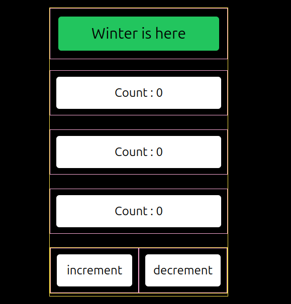
Explanation of the Code:
Centered Layout: The entire structure is centered with
flex items-center h-screen justify-center bg-black.Grid Layout: Inside, a grid layout is used (
grid items-center grid-rows-5 gap-4).Borders and Colors: Elements have different borders and colors for visual separation.
Buttons: There are increment and decrement buttons with consistent styling.
This structure and styling make it easy to create a visually appealing, interactive UI using Tailwind CSS. You can adjust padding, margins, text size, and colors as per your design requirements. The utility classes give you full control over the layout without writing custom CSS.


